
I have tried different layouts using the board as a portrait and as a landscape. I think the landscape one works better so that is the one I have decided to use.

I have laid out the photos in a way that I think will be eye-catching to anyone looking at my board.

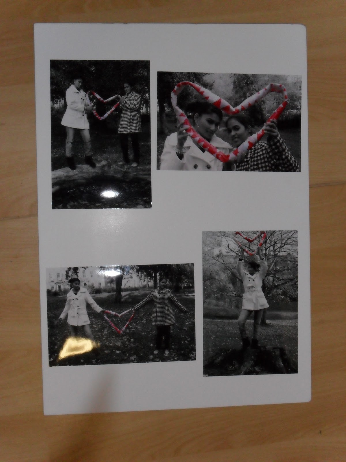
My favourite idea is this one. The close-up of the heart is positioned in the top left-hand corner of the board so it catches the eye of anyone looking at the images then the eye will travel down and across my images as though it was reading.
No comments:
Post a Comment